
Zaius Design System
Style and component guidelines to scale a B2B marketing automation platform, standardizing visual design and interface across product experiences.
ROLE
Designer & Project Manager
COMPANY
Zaius
DATE
Late 2019
SKILLS
UI, Visual Design, Design System, Collaboration, Documentation, Project Management
Background
From 2018–2019, Zaius was in a growth stage, expanding its product capabilities and design team. As the platform grew more complex, the lack of a design system led to over-designed, inconsistent components and workflow inefficiencies.
With support from the CPO, I proposed and led the creation of the Zaius Design System, a multi-phase initiative to bring order, consistency, and scalability to our UI. My goal was to create a shared foundation for designers and engineers to collaborate more efficiently, and to elevate the product’s overall usability and brand alignment.
Strategy & Approach
I structured the project into four key phases:
-
Design: Build a master component library in Sketch with detailed guidelines for designers and developers on when and how to use each component.
-
Build: Partner with engineering to build reusable components.
-
Refactor: Replace legacy elements in the existing UI with standardized components.
-
Customize: Improve the visual design for greater alignment with product principle, ensuring accessibility, consistency, and a more polished, delightful user experience.
Using an initial audit of existing components, I estimated scope and divided the work into a sprint schedule across the design team. Mindful of other work and responsibilities, I allocated 50% of my own time and 20% of two other designers' time, setting quarterly goals for each phase.
The system was organized using atomic design principles: starting with foundational styles (atoms), then components (molecules), and finally reusable patterns (organisms). I prioritized work based on frequency of component use or relevance to upcoming product work. More complex needs, like an updated color palette or cross-team voice/tone guidelines, were planned for later phases.

Style & Component Exploration
Collaboration & Tools
The Product team was already using Blueprint.js as a technical base, customizing components to fit the Zaius brand, so we continued using this library as our design system foundation. We used Sketch to document and InVision to share the guidelines internally. Each component in Sketch included visual styling, usage guidelines, and behavioral specs (e.g., states, interactions, spacing).
On the engineering side, we used Storybook to build the live React components. During feature development, designers worked closely with engineers to ensure existing components were used properly and efficiently. Having Storybook in place allowed engineers to reuse components confidently, while enabling PMs to reference standardized elements without redocumenting behavior for each project.
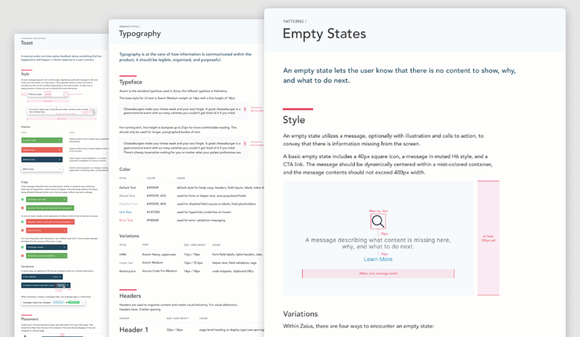
Sample of Design System Guidelines (scroll vertically & click through above to explore)
Outcome & Impact
The Zaius Design System significantly improved the team’s ability to move faster and more consistently. Designers had a shared source of truth, engineers had documented ready-to-use components, and product managers had greater visibility into the UI building blocks.
For example, when designing a new feature, I could quickly look up an existing dropdown Sketch component, confirm the component's states and placement rules via the documented guidelines, and drop it into a mock with confidence. The engineer could then implement it directly using the live Storybook component—no extra back-and-forth needed.
The system became widely adopted across the R&D team and played an important role in supporting new feature development. After Zaius was acquired by Optimizely, the design system was eventually replaced with Axiom. Still, our guidelines served as a helpful reference for component documentation and helped fill early gaps in Axiom’s adoption.