
Iconmania
A cross-product initiative to create a unified iconography system across the Optimizely portfolio, increasing consistency, scalability, and brand cohesion.
ROLE
Designer & Project Manager
COMPANY
Optimizely
DATE
Late 2021
SKILLS
Visual Design, Collaboration, Documentation, Project Management
Background
Following a period of rapid growth and multiple acquisitions, Optimizely’s product suite had become a patchwork of visual systems—each with its own icon sets, styles, and implementation patterns. As part of a broader effort to align interfaces with the evolving Optimizely brand and Axiom design system, I led a project to consolidate and standardize icon usage across all products.
This initiative, internally dubbed Iconmania, aimed to not only unify the visual language across tools but also streamline design and development workflows, reduce implementation inconsistencies, and support a more predictable and trusted user experience.

Disparate Products
Objectives
The project had four primary goals:
Visual Consistency
Establish a single, cohesive icon style across products using Font Awesome v6 as the foundation.
Scalability & Simplicity
Minimize custom icons and reduce maintenance overhead for design and engineering teams.
Cross-team Alignment
Ensure icon choices made sense across use cases and were appropriately distinct, contextual, and intuitive.
Design System Integration
Document the icon system within Axiom and create component libraries for both designers and developers.
Process
Audit & Assessment
We began with a full audit of the icons being used across each Optimizely product. This involved collaborating with each product designer to catalog all icons, what they signified, where they appeared, and how they were implemented.
Through this audit, we confirmed the following assumptions:
-
Icons across products were used differently such that similar icons had conflicting meanings
-
In some cases, icon usage was duplicative or unnecessary in the first place
-
Prior design or tech debt contributed to inconsistent icon use even within a single product

Optimizely Data Platform (ODP) Icon Audit
Consolidation
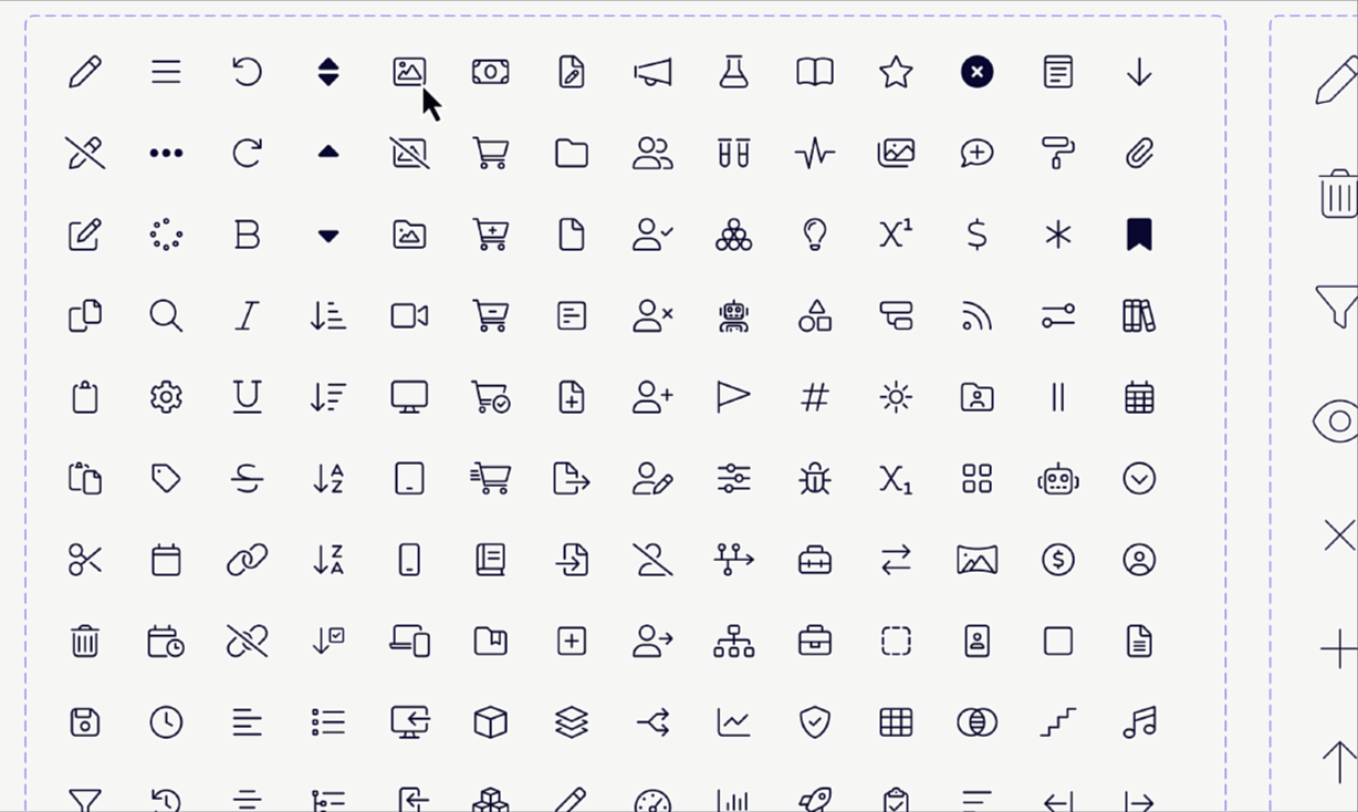
Next, we mapped each existing icon use case to its closest equivalent in Font Awesome v6. This stage involved both technical alignment and design judgment, aligning on visual paradigms for consistency while also determining when a concept needed a new or custom icon. We identified the need for various size options and created larger or smaller variants only where needed to keep the component manageable.
I crafted as few custom icons as necessary where no suitable Font Awesome equivalent existed, using combinations of existing icons to be mindful of scalability and visual cohesion. Finally, we removed any icons that no longer served a meaningful function.

Icon Consolidation & Custom Creation
Documentation & Delivery
With the new icon set finalized, I worked with the design systems team to componentize and document the icons within Axiom. For the design team, I created a component library in Figma featuring all approved icons with naming and usage guidelines. Icon components were organized by size—with all chosen size variants aligning to an 8-pixel grid system—or by specific use case, such as those selected specifically for use in app navigation.
In parallel, a corresponding developer component library and developer documentation were created and shared internally. The design systems team and I agreed on implementation details, such as icon naming and file packaging requirements, to best support development teams.
Both design and developer resources were documented comprehensively on the internal Optimizely Design site, run on Joomla, with naming conventions, descriptions, instructions for implementation, and accessibility guidance. As a bonus, I was able to create a custom-coded search widget to help designers and developers quickly find icons within the online documentation based on icon name or description of use.
Axiom Icon Documentation (scroll above to explore)
Implementation & Impact
Because each product had different UI structures and technical constraints, rollout was decentralized. Each product designer was responsible for working with their respective teams to scope the level of effort required to implement the new icons, prioritize icon replacement work based on UI impact, and develop a rollout plan.
There was no universal release date; instead, we adopted a staged approach, with implementation proceeding at the product team level. Teams were encouraged to monitor feedback and assess for any usability or recognition issues post-release.
Iconmania marked a key step in unifying the Optimizely product experience, enabling faster design and development, reducing redundancy, and creating visual consistency across a complex product portfolio. Moreover, this process became a model for how to operationalize system-wide design changes across a decentralized, post-acquisition product ecosystem.